by Michael R. Allen
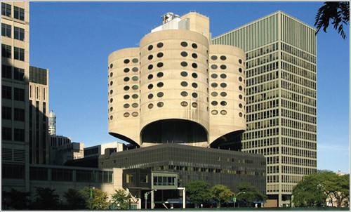
Last week, the Chicago Commission on Landmarks for the second time unanimously voted to rescind the landmark designation for Bertrand Goldberg’s Prentice Women’s Hospital (completed in 1975). The vote essentially dooms the innovative concrete-shell modernist hospital building to demolition whenever owner Northwestern University decided to tear it down. Additionally, the vote is an odd smack-down of preservationist pragmatism. Preservationists were not insensitive to the programmatic needs of Northwestern University, and did not hold fast to a you-can’t-touch-this absolutism, but instead started embracing the defiant modern design of our time. Alas, what might have been an outstanding moment for solving a tough preservation problem is now just fodder for preservation theory books. Chicago will not be building on precedents that include an unfairly understudied example from St. Louis, where the Washington University School of Medicine demonstrated how important architectural modernism could be preserved amid shifting programmatic needs.
Preserving Prentice Women’s Hospital: Preservation Gets Creative
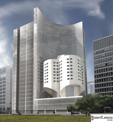
Possible Prentice additions were unveiled late last year by the Chicago Architecture Foundation, which sponsored a competition in partnership with the Chicago Architectural Club and the Chicago Chapter of the American Institute of Architects. (Northwestern University’s need for modern laboratory layouts cannot be accommodated without an addition of some sort.) One design, by BauerLatoza Studio, placed an addition adjacent to Prentice — a conventional gesture. Yet the architects transcended preservation gospel and connected part of the Prentice tower with the new building. The winning proposal by Cyril Marsollier and Wallo Villacorta absorbed the Prentice pavilion into an ephemeral, nearly dissolving glassy mass that mirrored the clover leaf back. This optical illusion of preservation certainly was clever.
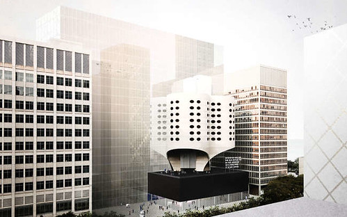
The competition entries did not garner as much interest or support as a theoretical addition drawn by Jeanne Gang and published by New York Times critic Michael Kimmelman. Gang’s approach was like a totem pole that stacked layers of architectural history: a new glass box, raised over an extended Prentice core (remember, the core supported the cantilevered “leafs†of the building). Gang’s design ingeniously championed the building’s significant triumph of engineering, bookended the iconic tower between its glass base and a new addition and left the Goldberg section free and distinct. Plus defying our expectation of where an addition should go was brilliant, and the sort of gesture that great modern design should make when engaging the past (and St. Louisans now might be urged this way upon seeing David Chipperfield’s Art Museum addition). The Vitruvian traits of firmness, commodity and delight spur architects to avoid copying when designing additions – but “delight†seems to be a binding hangup of many designers.
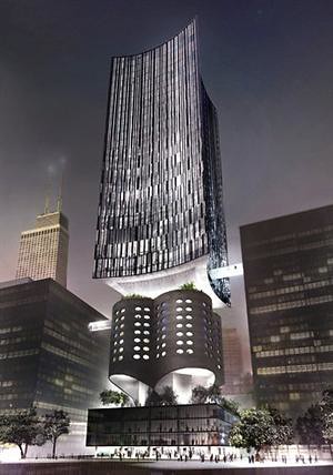
Preservationists seemed to tilt toward accepting Jeanne Gang’s approach, but the plan raised some old bugaboos in the field. The professional practice of American historic preservation is rooted in the application of the Secretary of the Interior’s Standards, federal guidelines adopted as part of the National Historic Preservation Act. Those standards discourage imitation and innovation alike in building additions. On one hand, the standards state that “new work shall be differentiated from the old and shall be compatible with the massing, size, scale, and architectural features to protect the historic integrity of the property and its environment.” Differentiated does not equal original, though.
The standards continue: “New additions and adjacent or related new construction shall be undertaken in such a manner that if removed in the future, the essential form and integrity of the historic property and its environment would be unimpaired.†Essentially, the standards are drafted to anticipate only conventional additions tacked onto an existing building, and they are drafted to encourage boring, minimalist additions that neither replicate great buildings nor match their levels of brilliance and materiality. The Secretary of the Interior’s Standards sections on building additions do not anticipate a vertical addition; nor do the standards really anticipate additions that could be visually superior to the original buildings (like the Arcade Building is to the Wright Building in St. Louis — never would have passed the Secretary’s standards test).
Hospital Expansion and Historic Preservation: Uneasy Relations
The Secretary of the Interior’s Standards for additions are not much of a match for the rigorous, protean demands of hospital and medical research facility architecture. Hospitals’ programmatic loads necessitate dramatic changes in building volume, mass and orientation. Wings, build-ups and even extra upper floors are common changes. Chicago is no stranger to the resolution of conflicts between the demands of medical use and the expansion of architecturally significant facilities. At Michael Reese Hospital, another careless episode in Chicago preservation planning, evolution meant successive eras of design had to co-exist. As uses must be kept contemporary, so must design in the hospital world. Modernism in building design served as simulacra for the progressive image that the medical profession hoped to embody — and hospitals hoped to convey.
Who would want to be admitted to a hospital housed in an outdated building? That is a question that preservationists must admit is part of the psyche that our rational appeals will never nestle. At Michael Reese Hospital in 1907, the modern shelter was the original building designed by Schmidt, Garden & Martin. That cornerstone of the hospital’s Prairie School ornament and geometric form demonstrated the best realization of the early Chicago architectural Zeitgeist. Later, as the hospital grew and changed, the hand of Walter Gropius via The Architects Collaborative came into play around 1945. Gropius’ team, which at various points included Lester Collins and Hideo Sasaki, created a stunning master plan that matched the Prairie School building with the modernist sensibilities of planned open space, monumental treatment of building forms and minimalist facades. Geometry still prevailed, and thus a harmony between old and new was forged. Alas, the entire hospital complex was felled by Mayor Richard M. Daley in an act of inspired Philistine behavior.
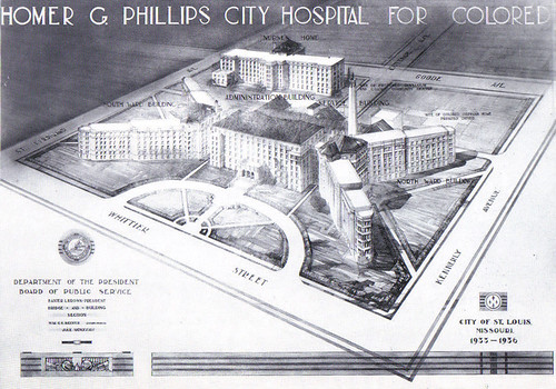
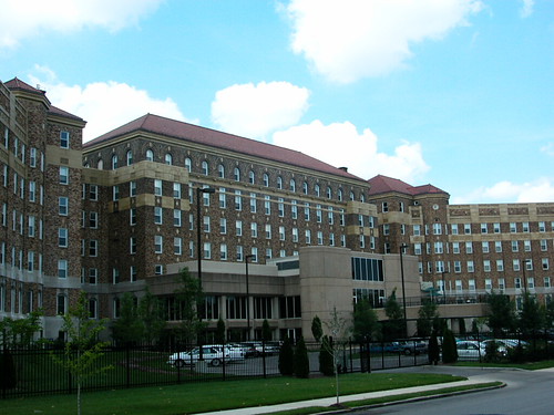
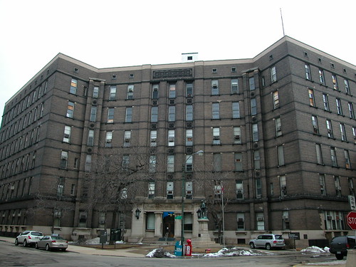
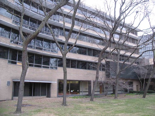
Still, modernism frequently has been a culprit in disturbing alteration of older hospital buildings. The Art Deco Homer G. Phillips Hospital in St. Louis’ Ville neighborhood lost its original entrance to a Brutalist entrance pavilion in 1965. The X-shaped hospital was completed in 1936 from plans by municipal architect Albert Osburg, and its otherwise imposing form translates into something soft and approachable through the use of polychromatic brickwork, red Missouri granite and bay-ended wings (no hard angles). The entrance box is a harsh concrete mass, with a segmental design that is out of place here. When the long-vacant buildings were rehabilitated, the owners decided to retain the addition rather than restore the original look – a costly project. An International Style clinic on the south end of the building, appended earlier and at least matched in brick tone, also survives.
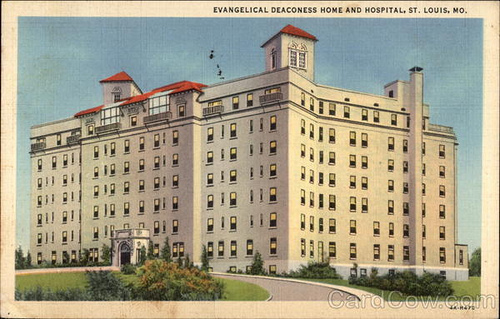

Then there were the dreadful alterations to the Deaconess Hospital on Oakland Avenue, most recently Forest Park Hospital. The Mission Revival towers of Tom P. Barnett’s romantic original building (1924) sit as trophies atop a confusing mess of mass. There are numerous additions and the re-cladding of the main hospital building in a pointless late modern skin that fails to own the triumph of erasing earlier and better architecture. Forest Park Hospital is about to be demolished; the blemishes there render all but two buildings unrecognizable and thus ineligible for inclusion in the National Register of Historic Places. Here’s where the Secretary of the Interior’s Standards would have prevented an ungainly result.
To the Contrary: Harris Armstrong’s Cancer Research Building
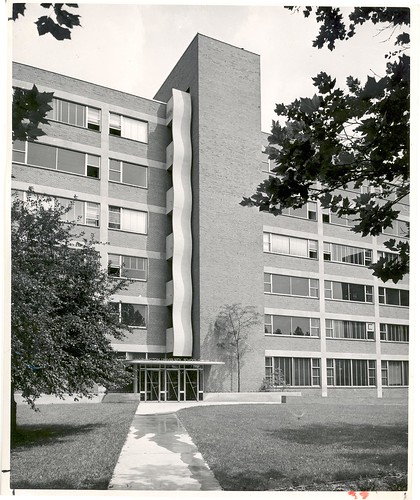
However, St. Louis also has an example — lesser-known, of course — of how a modernist medical building was expanded and essentially preserved. That building is Harris Armstrong’s Cancer Research Building (1951) at the Washington University School of Medicine, once facing Euclid Avenue across a suitably expansive mid-century lawn. Armstrong’s flat-roofed, cubic gridded building is a master statement of simplicity and purpose. The building’s concern for daylighting the interiors through large windows was a strong break from classical conventions.
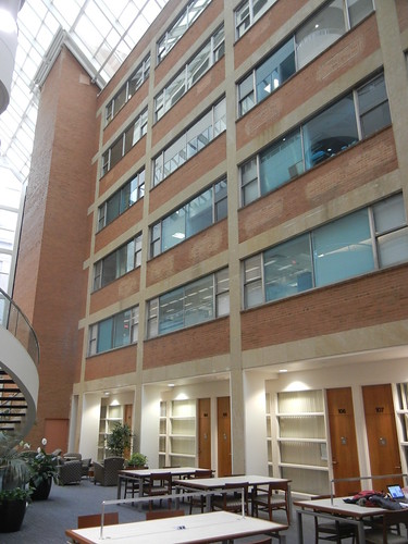
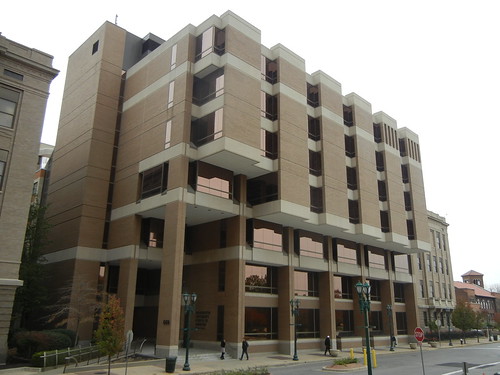
Yet the Cancer Research Building changed dramatically when in 1989 the building was expanded with a large addition housing the Becker Medical Library. Hellmuth Obata & Kassabaum designed the the brick and concrete late Brutalist addition. The addition partially takes its material cues from Armstrong’s earlier work, but its jagged massing could not be less similar. Yet inside, the two masses are deftly separated in a lovely atrium. Armstrong’s building’s façade is still visible, if adapted for interior circulation. Still, the reverence for Armstrong’s building gives it a heavy presence in the new building – not like its original presence, of course, but something with its own level of interest and beauty.
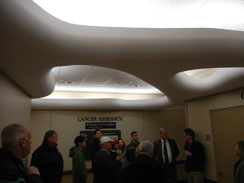
Some works of architecture can fall to greater or equal works without apoplexy among stewards of history. Yet some absolutely should be protected and married to institutional building programs’ evolution. Prentice Women’s Hospital and the Cancer Clinic both are in that measure of hospital buildings whose designs are singular and significant. Alas, Chicago has done the wrong thing while St. Louis years ago made a wise choice. Still, the potential to save Prentice and the realized preservation of the Cancer Clinic entailed creative strategies of additions perhaps not sanctioned by the Secretary of the Interior. Why should we mind? Any human person can touch an early example of Harris Armstrong’s genius, juxtaposed with an interesting statement by other important local architects. That is the essence of historic preservation.

