by Michael R. Allen

The new Grand Avenue viaduct over the Mill Creek Valley will be a decent and well-built piece of infrastructure. Replacing a streamlined structure from 1959, the new viaduct skips over its mid-century predecessor to appropriate elements of the original Grand Avenue viaduct. Or does it?

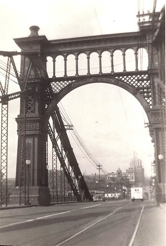
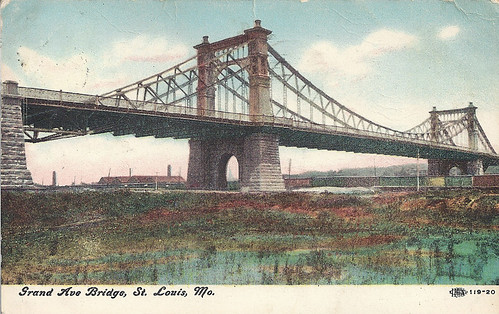
The Grand Avenue viaduct was completed in 1891 as a true suspension bridge. Its piers were of solid masonry, its towers were strong metal and its metal bars carried the weight of the bridge deck. In short, everything that gave the bridge grace and form was a matter of necessity instead of affectation. The beauty of such a bridge lies in the seamless marriage of engineering and architectural design.

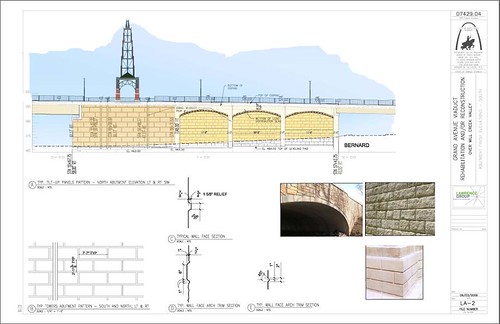
By comparison, the new Grand Avenue viaduct affects a nostalgic image by placing anemic, open work towers at certain intervals and cladding parts of its base in false rusticated limestone. The homage to the 1891 structure seems strange for a modern truss bridge, which of course has its own very intriguing structural form hidden under the trappings of style. The new viaduct will be a decent attempt at falsely historic detail, like Busch Stadium or countless urban infill houses with wooden cornices and brick veneers. However it will not match either of its predecessors in plainly and gracefully exhibiting its true form or its actual materiality. The elegant expression of a structure’s true form and material is the origin of greatness in design.

5 replies on “A Nostalgic Grand Avenue Bridge”
“…steel cables carried the weight of the bridge deck.” Actually, the bridge was supported by linked bars, creating several chains (twelve, judging from photos found in the links below) by which the load was carried. These bars were likely iron, not steel, probably for cost considerations. For even though modern steel was quite in abundance by the late 1880’s-90’s, it was yet still likely somewhat too expensive for the purposes for which the City had for it. Though the iron, in this configuration, would have been well sufficient in strength. I could, however, by incorrect in that assumption, at least according to this site: , which says that the towers are in fact fabricated from steel. So it could be that the bars (eye bars) are in fact also made of steel. More info here, as well: . Either way, the new viaduct is a wretched pastiche of a design: inelegant, clumsy, lacking in both imagination and structured thought. The “towers” it would seem, will stand in mockery to the original King Bridge Company design. Moreover, these carbuncles will probably sport some signage paying homage to the fact that the new viaduct will be proximate to the SLU ghetto. UGH. Apparently, the old bridge was quite sound structurally, as it took three years to demolish. It appears there was no consideration or thought given to incorporating the old bridge into the a plan for an expanded number of auto lanes, which was the impetus for a new structure over the Mill Creek Valley, funded by a portion of the $63 million federal renewal program for the area.
http://bridgehunter.com/mo/st-louis-city/grand-ave/, http://www.kingbridgecompany.com/GreatKingBridges.htm Here are the links again, without the incorrect quote and equal signs. *crosses fingers*
Thanks, Samizdat. I deliberately oversimplified here to make the larger point. The technical details are welcome.
I feel it appropriate to chime in as I was a part of some of the aesthetic improvements while working with a local Architecture firm. I came in late to the project after years of start again-stop again design, each restart the result of unfortunate paring down from the previous design. You will find no argument from me that the original design was nearly a work of art, much more appreciated by the design community today than most designers of the 50s who would have viewed the second design. If it was up to Elliot Davis who reported on the current aesthetic improvements, we would have no ornamentation whatsoever.
To replicate the original beauty may have been a $50 to $75 million effort instead of our current $26 million. Unlike the previous bridges, the new bridge will have bike lanes on each side, planters and wide walkways on each side and a planted median. The plants will be expertly maintained by SLU.
Jhlandguy makes some good points. Whatever you think of the ornamental/aesthetic aspects of the bridge, the new design should certainly be a big improvement from a pedestrian and bike point of view. Looking at the bridge only in elevation doesn’t show that or give a sense of what the experience of someone actually crossing the bridge will be.
I was also involved in the design at a much earlier stage, and the bridge has clearly been “value engineered” (one of my least favorite euphemisms) considerably since then. Achieving a graceful expression of form and materiality is not just a matter of stripping away ornamentation. It often requires choosing the more expensive option when it comes to materials, connections, means of structural support, etc. I suspect the current designers were faced with some unpalatable choices in arriving at the present design.