by Michael R. Allen
 Finally seeing Up in the Air this week, I was able to relish a great moment for St. Louis modern architecture. Readers know that much of the film was shot in St. Louis, and the film rolls out familiar scenes: a street in Lafayette Square, Flora Place, the Cheshire Inn, the Gateway One building downtown, Mansion House and the interior of the General American Life Insurance Building are all spotted. Fans of local postmodern design no doubt took comfort in the fact that our downtown landmarks of the 1980s are so generic that they can double for Omaha’s. That placelessness is a triumph for the style, at least by Fredric Jameson’s measure.
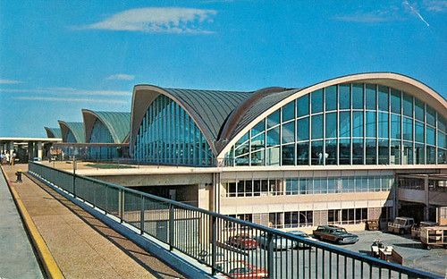
 However, the actual shining moment for St. Louis was the prominent feature of the main terminal at Lambert International Airport (shown above unsullied in 1970). Lots of the film takes place inside of the airport — again, the triumph of place-erasing architecture — but there is a splendid moment in front. George Clooney’s character Ryan Bingham has to get a snapshot of a cut-out of his sister and her fiancee in St. Louis for a display board of such photos at their rehearsal dinner. Bingham selects Lambert Airport, a choice questioned by his colleague Natalie Keener (Anna Kendrick).
The doubt pulls from Bingham a soliloquy about the role of the Lambert terminal in the development of modern airport architecture. Of course the soon-to-be newlyweds would want their cut-out photographed in front of the Lambert terminal. After all, this is the first modern terminal that set the standard before JFK or DeGaulle were designed. Despite the clutter we have tacked onto Hellmuth, Yamasaki & Leinweber’s 1956 terminal, it looks great in this scene. The terminal’s modernity shines through, and provokes one of several moment in which Bingham seems to break from his detachment to show love.
Bingham basically reiterates the words of critic Robert W. Duffy, who wrote a few years back that the Lambert terminal was “the first airport building to make a formal statement about aviation and aerodynamics.” The thin-cast concrete shell demonstrated that architecture could respond to the curves and contours of industrial design in an original expression.
Coincidentally, St. Louis’ other great modernist temple of travel also had a moment of film fame. Schwarz and Van Hoefen’s Greyhound Terminal (1964) on Broadway (interior seen here), demolished for the domed stadium we seem posed to soon demolish, was used in Planes, Trains and Automobiles. John Hughes chose to shoot the interior scene elsewhere, but the exterior was projected onto thousands of screens around the nation.
To some, the idea that St. Louis and modern jet-set travel — of which I make no claim that Greyhound is a part — are intertwined would seem foolish. Yet how did a supposedly complacent region embrace and build one of the landmarks of postwar international travel, and a bus station finer than almost any other ever built? We had great designers whose wellspring of innovation was too great to be harnessed by innate local conservatism. That conservatism was as strong in 1956 as it is in 2009, too, so we don’t get to cop out and rest on our cynicism. If a place-loathing cynic like Ryan Bingham can show some love for St. Louis’ modern architecture, why can’t we?
