by Michael R. Allen
Grand Avenue soon will feature two striking examples small modernist buildings imaginatively adapted for food-based businesses (the “flying saucer” at Council plaza hopefully needs no introduction here). South Grand’s lone glass box, the Hamiltonian Federal Savings and Loan Association Building, is set to become a second location of Dave Bailey’s popular restaurant Rooster. Construction is now underway.
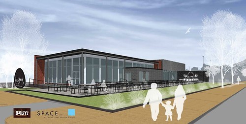
Bailey’s project is utilizing historic tax credits, and as part of the process Preservation Research Office prepared a National Register of Historic Places nomination for the one-story former savings and loan building. Those who pass by the International Style building, or park in its lot before heading to Mangia late at night, might be surprised by its architectural significance.
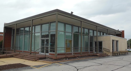
The Hamiltonian Federal Savings and Loan Association Building is an outstanding local example of the application of International style design ideas applied to a small neighborhood savings and loan association building. Completed in 1962 and designed by the local partnership of Winkler & Thompson, the building differs from other financial institution buildings of the time for its embrace of the classically-influenced school of modernist design advanced nationally by Mies Van De Rohe among others.
Many local financial institutions turned to the styles of the Modern Movement between 1940 and 1980, but most embraced either eclectic modernist approaches or traditional styles. In the city of St. Louis, where construction was fairly modest in the early 1960s, there is no stylistic peer to the Hamiltonian Federal Savings and Loan Association Building.
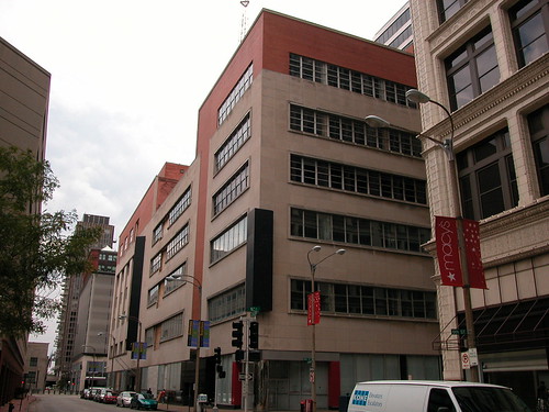
The architecture of financial services companies changed along with the larger trends in American commercial architecture. Amid the Great Depression came strong federal regulation of banks, savings and loan associations and securities exchanges. At the end of World War II, with GIs returning from the war to start new lives, banks, trusts and savings and loan associations saw a new customer base. As they sought to grow, these institutions embraced architectural modernism as a way to promote a more transparent and welcoming image than earlier classical buildings had done.
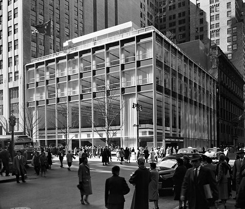
The national tone for new financial services architecture was partially set by the Manufacturers Hanover Trust Company’s new branch on Park Avenue in New York (1954). Designed by Gordon Bunshaft of Skidmore, Owings & Merrill, the Manufacturers Hanover Trust Company Building was an “all glass display case for banking” in the words of its architect.
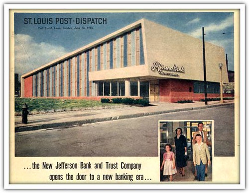
In St. Louis, however, there are few examples of glass banks. Partially this is due to the design practice of the dominant bank architecture firm in St. Louis, the Bank Building and Equipment Corporation (BBEC). BBEC’s chief designer after 1952 was W.A. Sarmiento, whose modernist practice embraced the International Style only as a reference for works – the Jefferson Bank and Trust Company Building (1955) being best-known — that explored curvature, including round and elliptical forms, variation in masses and roof forms with no reverence for the flat roof, and even the introduction of ornamental elements.
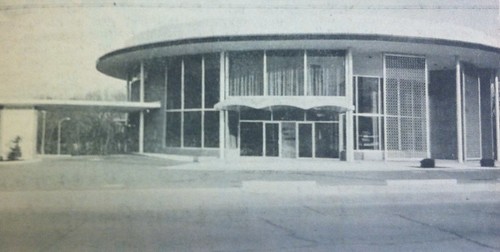

At the start of the 1960s, financial services architecture in the St. Louis area likewise was notable bereft of the glass box. The First Security Bank Building (1961; extant but altered) in Kirkwood, designed by Rathert & Roth, is a 78′ diameter circular building with glass walls behind pilotis under a shallow domed roof. The Security Mutual Bank built a new drive-in facility (1960; demolished) at 13th and Olive streets downtown, with the main component a brick box surrounded by segmental brise soleil of concrete block.
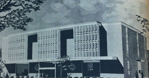
The Public Service Savings and Loan Association Building (1962; extant), designed by Kenneth Wischmeyer, is designed as a three story brick mass with a projecting heavy proto-Brutalist concrete grid on its main elevation. Yet by the middle of the decade city directories would be full of advertisements placed by banks and savings and loan associations with photos of modern drive-in “auto bank†additions and new buildings; the Mercantile-Commerce Bank at the corner of Grand and Lindell boulevards went so far as to advertise itself in 1963 as “Midtown’s most modern bank.”
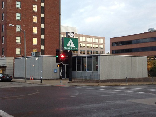
At least three 1960s financial services buildings in the St. Louis area came close to embodying the tenets of the Miesian box. One was the Hamiltonian Savings and Loan Association Company Building. Another is the Missouri Savings Association Building (1966; Smith-Entzeroth; extant but greatly altered) at 10 North Hanley Road in downtown Clayton, Missouri. The one-story building sat on a podium and consisted of a floating concrete roof set on four corner columns above a plate glass curtain wall. The building has been remodeled beyond recognition. The other is the diminutive United Postal Savings Building (1962; Kromm, Rikamaru & Johansen; extant) at 18th and Olive streets in downtown St. Louis. With walls of polished granite contrasting with plate glass walls at its main entrance corner, the one-story flat-roofed building embodied the formalism of Miesian design if not the purity of the “glass box.”
In 1961, the Hamiltonian Federal Savings and Loan Association hired Winkler & Thompson – a firm whose output included no other modernist works — to design its new headquarters branch on South Grand Boulevard adjacent to its existing location. By then, the neighboring Tower Grove Bank located on the block to the north had clad its two-story Beaux Arts 1912 building with a Modern Movement slipcover in 1953.

The new building replaced a pair of two-story commercial buildings with apartments above. The city issued a permit to demolish those buildings on January 28, 1960. Hamiltonian’s construction permit dates to May 26, 1961, and reports a construction cost of $12,500.00. Hoel-Steffen Construction Company, with its office nearby at 3023 Pestalozzi Street, was general contractor and Belt & Given served as mechanical engineers.
The one-story building is surrounded by red brick walls on the two elevations not visible from the street, tying the building with local masonry tradition. These walls flank two glass-walled elevations comparable to the design of the Manufacturers Hanover Trust Company Building in New York seven years earlier. The construction announcement article boasted that the glass walls “reach from floor to ceiling and provide an open, clear view of the interior.†Such transparency served multiple purposes: to attract business, to assuage fears of robbery and to put the building in league with the most modern trends in architecture.

Hamiltonian embraced the automobile as well as the surrounding community with the new building. The 23-car parking lot offered another element of modern convenience. Dave Bailey plans to embrace instead the convenience of outdoor dining, which will replace the asphalt pad. At the east end of the south elevation is a wing that encloses a stairwell leading down to a basement area that contained a large meeting room that Hamiltonian made available to community organizations. Use of the building clearly was good for the visibility of the institution.
Hamiltonian Federal Savings and Loan Association occupied the building until its merger with Home Savings of America in 1981. After 1981, the Roosevelt Savings & Loan Association occupied the building until it was purchased by Mercantile Bank & Trust Company. Mercantile Bank operated a branch bank in the building until the late 1990s. Mercantile Bank sold the property to Commerce Bank, then the occupant of the former Tower Grove Bank building to the north. Commerce Bank leased the building to the St. Louis Public Library, which temporarily moved the Carpenter Branch Library there during renovation and expansion. Upon the Carpenter Branch Library’s re-opening in 2003, the building became vacant.
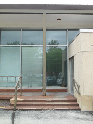
The preparers of the Tower Grove Heights Historic District excluded the Hamiltonian building from the district boundary, a common omission for modern works not considered to “belong†with older neighborhoods. In 2007, the City Treasurer came close to issuing bonds for a South Grand parking garage that would have occupied the Hamiltonian site. Thankfully, the march of time has built appreciation for the steel and glass business temple. South Grand’s varied streetscape includes other examples of modernism, ranging from St. Pius V’s 1950 recladding to vitrolite (shiny structural glass) storefront cladding.
The new Rooster will occupy a building that emphatically ties the business district to the best currents in mid-century modern design in St. Louis — design as materially rich and spatially ordered as any of the brick and terra cotta buildings that define the streetscape.
This article is based on the National Register of Historic Places nomination, which includes contributions from Lynn Josse and Lydia Slocum.


