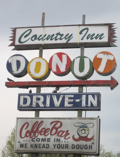
Categories
“We Knead Your Dough”
 Preservation Research Office
by Michael R. Allen
There have been more than a few changes around the intersection of North Florissant Avenue, 13th Street and Cass Avenue lately. In the past, I have lamented the destruction of the Crunden Library at 14th and Cass and the Brecht Butcher Supply Company buildings on Cass, noted (with a degree of lament) the fiery loss of an old bus maintenance garage on 14th and recently observed the National Register of Historic Places nomination for the old Cass Bank and Trust Company Building at 13th and Cass. Once upon a time, before a change in plans in 2007, I protested the proposed ramp system feeding the Mississippi River Bridge that would have cut right across the intersection and severed downtown from Old North forever.
Oh, and then there is the whole matter of Northside Regeneration! A lot can change a small area in five years’ time. Northside Regeneration, then known as Allston Alliance LC, purchased the old Schnucks store on Cass Avenue and eventually persuaded the Missouri Department of Transportation to route the bridge landing across that site to connect with Tucker Boulevard. Tucker is now being rebuilt by the removal and infill of the Illinois Traction System cut upon which it was built in 1932.
All of those big changes entailed removal of a very small thing, the once-shining Cass Bank sign that faced the northbound interurban trains of the Illinois Traction System. The sign was incandescent, with bulbs placed in channels spelling the bank’s name.
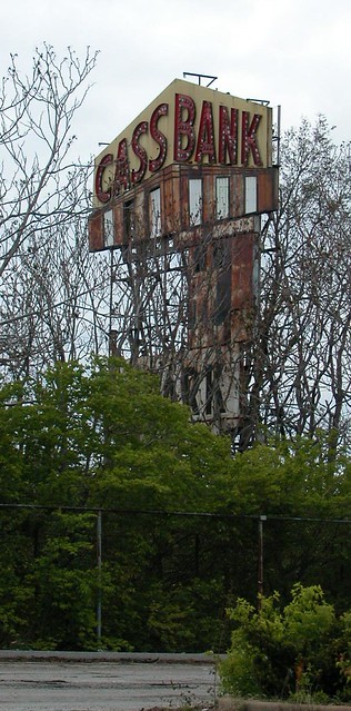
Deposit with us, the sign beckoned to all those yearning for a place to put their hard-earned money. All others could enjoy its bright lights which would have shone in the fall-winter dusk on their ride home from downtown.
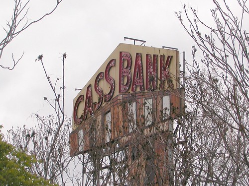
The lights went out years ago, after the trains stopped running in 1956, but the Cass Bank sign stood amid the jungle growing from the cut.
Standing behind the current Cass Bank home on North 13th Street, the sign was in the way of the new bridge-to-Tucker connection. And it disappeared earlier this year. Does anyone know what happened to it? Could its pointed wedge have been spared as a reminder of part of the history of a site now flattened into the future?

by Michael R. Allen
An article in today’s Madison County Journal reports that Bert’s Chuck Wagon restaurant has removed its landmark sign and will be reinstalling it inside the restaurant’s new home.
In a turn of rather thoughtless planning, the landmark restaurant’s A-frame Googie building will be demolished for the widening of Illinois Highway 159. Of course, many Metro East cities’ downtowns have suffered when state highways are routed around them. Collinsville at least will still have the highway running through the heart of town.
by Michael R. Allen
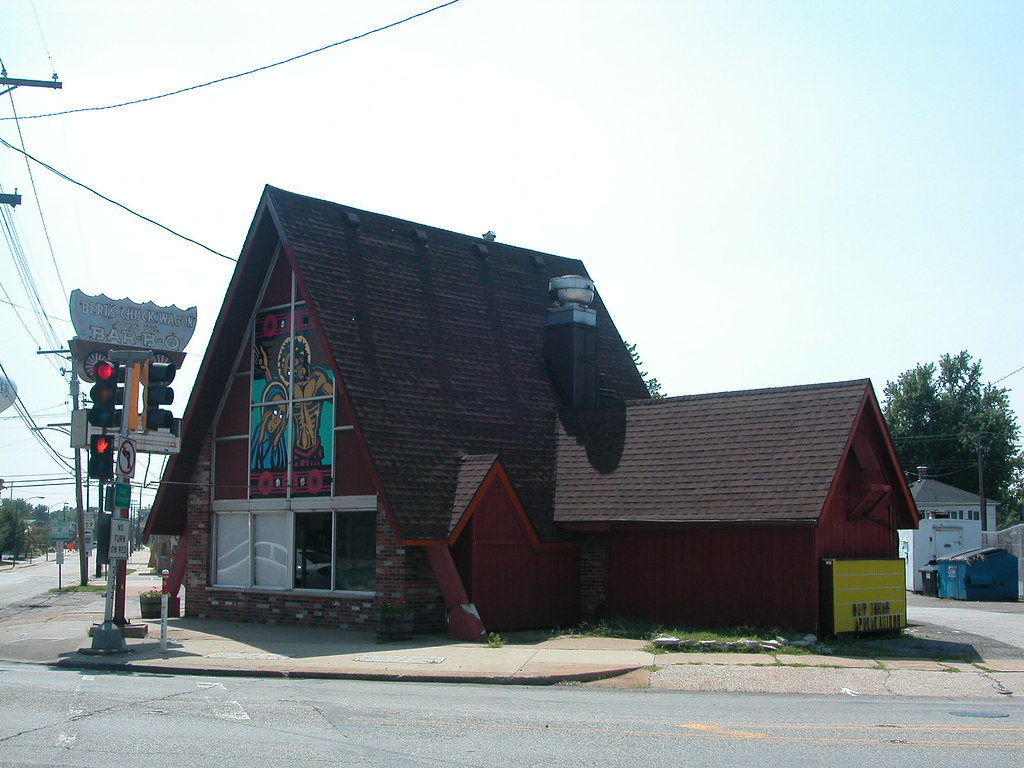
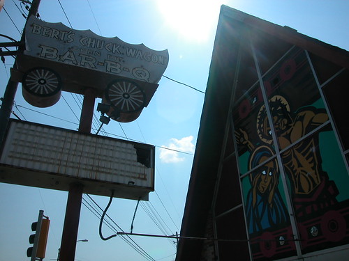 The Madison County Journal reports that Collinsville mid-century landmark Bert’s Chuck Wagon Bar-B-Q (see “Heavenly Bar-B-Q” will be demolished soon for widening of Illinois Highway 159. Bert’s Chuck Wagon will relocate to a nearby location on Main Street and move the fine conestoga sign to the new location. The A-frame building with the vivid religious scenes painted in its gable end windows, however, will be history.
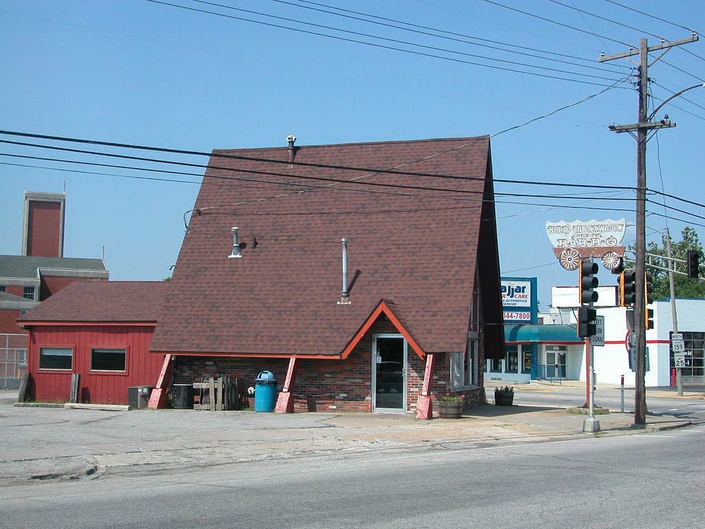
 The widening of Illinois 159 costs the state $56 million, and the sites of several tax-paying small businesses — not to mention at least one landmark mid-century building. Such an expensive project in recession may very well take away more economic activity over the long run than it generates.
See also “Mid-Century Modernism in Collinsville” (August 8, 2008).
by Michael R. Allen
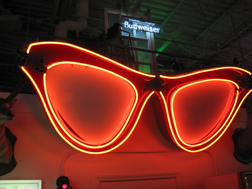
On Sunday, February 21, the Antique Warehouse hosted a fundraiser for the St. Louis Sign Museum. Guests were able to see the amazing private collection at the Antique Warehouse, which includes numerous neon signs, banners, signs, vehicles, tractors, campers, sewing machines, cash registers, pinball machines and so many other things a list would fill a small book. Greg Rhomberg is the mad genius behind the Warehouse, and has been collecting for years. One of the hallmarks of Greg’s work is thorough restoration of items that require it. In the case of neon signs, that means repainting and re-tubing. Here are a few photographs suggesting the scope of the Antiques Warehouse neon sign collection.
 Yes, the Lake Forest Pastry Shop sign is alive and well!


by Michael R. Allen
 For decades, Harter’s Hobby House at 1001 West Main in Belleville beckoned hobbyists with its colorful sign, which resembled a blue pin-striped stick of dynamite with a starlight mint-like pinwheel fuse. The sign is no more, having been replaced recently with a simple new sign.
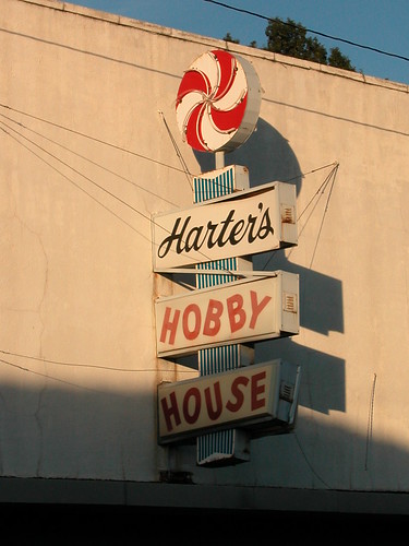 The old sign was a complex metal sign with three plastic back-lit name boards, an enameled body and neon tubing on the pinwheel. The letters in the possessive “Harter’s” were proper cursive fit for business, while the words “Hobby House” had a carefree lettering somewhere between kindergarten script and a typesetter’s mistake.
Where did the sign go? Anyone with information is welcome to post in the comments section or email the editor, who missed the changeover.
by Michael R. Allen
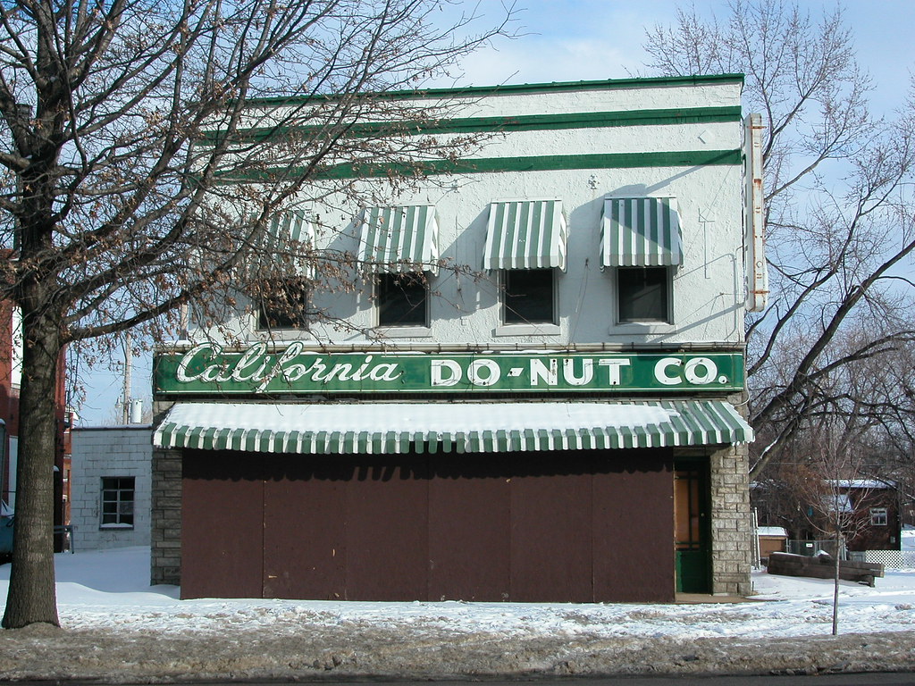 Yes, the much-mourned California Do-Nut Co. at 2924 S. Jefferson in Benton Park sports a storefront addition. The 1909 Sanborn fire insurance map shows the two-story building as a black smith shop, and building permits suggest that the addition dates to 1920. Here the addition seems to become part of a larger, mid-twentieth-century remodel. The parent building received a coat of stucco, the addition is clad in a Permastone-type material and the enameled neon sign board has an unmistakable modern swagger. The white and green color scheme is also sporty and simple, the hallmark of good mid-century design.
If the donut stands are doing well on Hampton and Watson road, why not Jefferson? Obviously, a little remodeling of that old store is needed, but the end result is an urban version of the roadside snack stand. Alas, a fabled reopening only led to plywood being hung on the storefront.
by Michael R. Allen
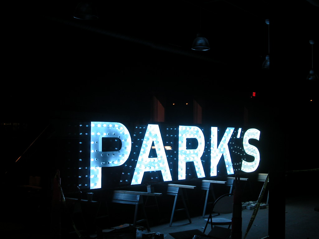 This week, night-time pedestrians trying to catch a glimpse of the rehabilitation progress on 14th Street in Old North St. Louis saw the light — the light of the newly re-lit Park’s Drugs sign that has been a fixture of the intersection of 14th Street and St. Louis Avenue for decades. Although the sign resides inside of the building that once housed Park’s Drugs, soon it will return to the side of the building.
The sign’s restoration is testament of a dramatic rescue of both the sign and the building. In 2004, this is what the Park’s building (built in 1931) looked like:

Colorful murals adorned plywood hiding the sad fact that most of the roof had collapsed inside of the building. The sign had once been symmetrical, wrapping the corner with the word “DRUGS.” The sign was reduced through overzealous actions by the state pharmacy license coordinator in 2000. The coordinator was enforcing a state law that forbids use of the word “drugs” in signage on a business that does not have a pharmacy license. The Park’s building was fire-damaged, vacant and owned by the city’s Land Reutilization Authority.
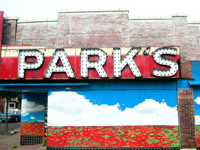
The scrap value of the enameled metal sign board was high enough that many wondered when the sign would simply disappear. However, the worst never came. Instead, the Park’s building became part of the transformational Crown Square redevelopment project that started in September 2007 and is slated for completion this April. That project entails gut rehabilitation of 27 buildings as residential and retail spaces and the reopening of the closed section of 14th Street.

The Park’s building will even return to its original life. The entire building will be returned to retail use soon. Substantial work is complete and the building has been used for art openings, community events and educational events in recent months.
by Michael R. Allen
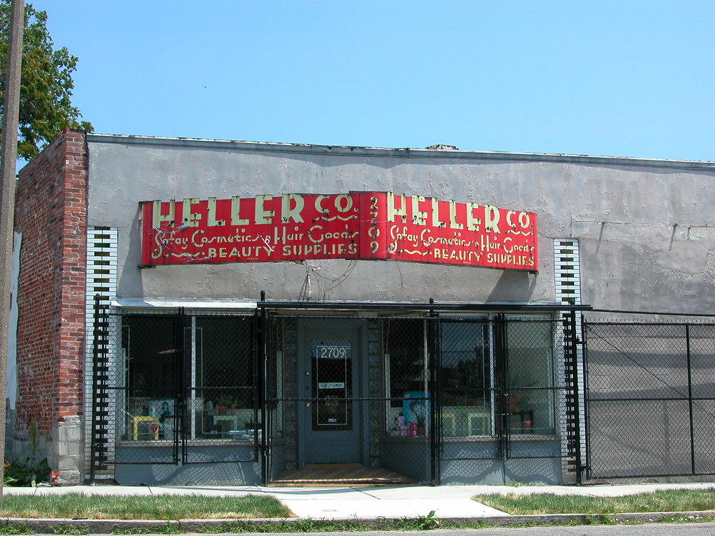 The old brick building, already refaced with glazed brick after street widening in the 1920s, has a mess of stucco across the front. The storefront is covered by chain link gates. The exquisitely-lettered enamel sign board has long lost its neon tubing. This block has lost most of its buildings and businesses, and blocks east and west of here are equally forlorn. Yet the Heller Beauty Supply Company has remained in operation since 1908 at the same location, 2709 Martin Luther King Drive (once Easton Avenue) in JeffVanderLou (once Yeatman).
The sign’s exaggerated moderne letters read: HELLER CO.; Sofay Cosmetics – Hair Goods; BEAUTY SUPPLIES. (That reading leaves out the squiggles.) Sofay Cosmetics was a line of cosmetics and colognes distributed exclusively by the family-run Heller Distributing Company. The Hellers distributed their own products here and elsewhere. The store has always sold a wide line of cosmetics and, most famously, wigs. According to family members, Ike and Tina Turner as well as Chuck Berry were customers of the shop over the years. Shriner clowns and Muny makeup artists also frequented the business.
Long-time owner and manager David Heller passed away in 1999, but his children still operate the business. This is still “the place” for wigs on the near north side, with a clientele from across the region.
by Michael R. Allen
A few weeks ago, the new St. Louis University Biolab building at Grand and Chouteau avenues gained an unfortunate appendage: a large fleur de lis atop the attached tower section. While the site plan for the building is abysmal, the building itself has many redeeming qualities. Overall, Cannon Design gave the building a restrained modern sensibility — within the constraints of St. Louis University’s constant use of architecture as branding. (Such practice mars both architecture and the brand, methinks.)
At night, the fleur de lis glows blue with neon light. It is a huge distraction from the building, and clashes severely. However, there is another problem with the symbolic flower. A friend and I noted that the center crest seems a bit low, and the wings — yes, those are wings –too wide.
Here is the sign at night:

Here is a common fleur de lis symbol:

Something seems wrong with the proportions. The sign is too short and too wide. Perhaps it emulates not our city’s symbol but a popular napkin folding shape:

The alternate meanings are many. The ascot could symbolize the laboratory’s formality, or maybe its adherence to the academic tradition of inquiry. The napkin symbolizes cleanliness, an important quality for a laboratory. Napkins also suggest that the laboratory is well suited to “clean up” in the field of biomedical research — a goal of local civic leaders. Of course, wings suggest flights of inspiration and the lofty goal of developing cures for human ailments.